The 
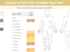
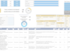
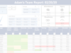
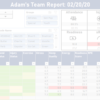
Ultimate Player Dashboard Tutorial

Benefits: What You Get

Interactive Dashboard

An insanely dynamic and interactive dashboard; data-driven insights into an athlete's performance and training load can be made, including comparison to his/her cohort and changes across your choice of time frames.

Undiscovered Excel

Exposure to many little-known and underutilized Excel features and time-saving tricks.

Knowledge and Skill

A ton of real-world knowledge for data management, organization, and display while developing your software and Excel skills.

IF YOU WANT THE FINAL EXCEL FILE OUTPUT FROM THE ULTIMATE TEAM DASHBOARD TUTORIAL, IT IS AVAILABLE ON THE PRODUCTS PAGE.

Interactive Player or Athlete Performance Monitoring Dashboard in Microsoft Excel

First Things First

Download the data set by clicking the button below so that you're ready to follow along with the videos.

THE TUTORIAL VIDEOS

We review the dataset we use for this video series and go over our dashboard plan. And yes, it’s extremely important to have a plan before trying to build your dashboard!

We create in-table calculations to derive important metrics we want to visualize and we create a formula to join information from multiple tables together into a single table, automatically (e.g., profile data with performance testing data with daily training load/readiness data).

We start creating the content on our visualization dashboard. We use INDEX, MATCH, and XLOOKUP formulae to dynamically take athlete profile data and injury status that coincide with the athlete and date we select.

Do we want to compare the athlete’s data to himself, the position group, or the team? Well, now we have a choice that we can manipulate with a click of a button.


We create formulae to not only encompass the cohort we want to compare the athlete with, but we’ve also added the ability to change the date range for which the player, position, or team average should be based on. This is a very powerful, but complex video. Have your coffee on-hand for this one – big formula ahead!


We create KPIs which display the athlete’s most recent athletic performances. We get the latest Trapbar Deadlift, Bench Press, Countermovement Jump, and Body Fat Percentage outcomes, as well as the dates associated with these performances, to display on our dashboard.


We review how to display headshots (or images) for our athletes. We pick an athlete, and their headshot (or image) automatically displays on our visualization dashboard, too.


We create a few dynamic drop-down menus that automatically update to accommodate for added or removed items. We also set up a structure that lets us get a series of latest dates in a dynamic fashion.


We create a pretty intense formula that allows us to visualize a metric that we select from a list of metrics, and also, we create a formula that allows us to dynamically control the number of days we use in a rolling average calculation with the click of a button.


We start the visualizations via, well, doing a little bit of everything. We create a few dynamic graphs, apply some conditional formatting to injury status and participation status, and we organize our dashboard layout.


In the video, we build colorful gauges to quickly identify how an athlete’s training load and readiness correspond to their norms.


We create a really cool conditional formatting visualization using data bars, and we drastically enhance the organization of our dashboard design.


We create another graph and put the finishing touches on our stunning dashboard design. See the level-up videos to incorporate more features that not only will add tremendous value to your dashboard, but will give you a ton of practical Excel knowledge.


We make changing dates a lot easier on ourselves by adding multiple date scrollbars (really spin buttons) that all talk to one another, and we go over some neat graphing tricks.


If you’re a Seinfeld fan, you’ll get the title reference here. Click here to watch the scene. We learn how to apply text-based logic to tell us (and the dashboard viewer) what data is being compared. We have a lot of ways we can manipulate our data, and we create a way to automatically display the types of data we are comparing, based on our dashboard manipulations.


We create an awesome graph that lets us see color-coded injury status over time along with a metric that we select. We also go over a little bit more text logic and using shapes/illustrations in Excel.


We create the ability to assign teams to athletes, create a dynamic drop-down list of teams that then filters our athlete list to only athletes on that team. But first, we go over a nifty trick that allows us to make quick, holistic adjustments to many areas of the dashboard at one time.


If this experience helped you or if you have any questions, let me know! Connect with me on social media or send me an email to share your experiences.

Let's Keep In Touch!