The Ultimate Team Dashboard Tutorial

Benefits: What You Get

Interactive Dashboard

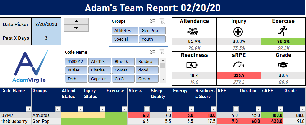
An insanely dynamic and interactive dashboard; data-driven insights into teams, groups within teams, and individual athletes can be made.

Undiscovered Excel

Exposure to many little-known and underutilized Excel features and time-saving tricks.

Knowledge and Skill

A ton of real-world knowledge for data management, organization, and display while developing your software and Excel skills.

IF YOU WANT THE FINAL EXCEL FILE OUTPUT FROM THE ULTIMATE TEAM DASHBOARD TUTORIAL, IT IS AVAILABLE ON THE PRODUCTS PAGE.
First Things First

Download the data set by clicking the button below so that you're ready to follow along with the videos.

THE TUTORIAL VIDEOS

We review the dataset we use for this video series and go over our dashboard plan. And yes, it’s extremely important to have a plan before trying to build your dashboard!

We create the first item on our dashboard, which is one, very important, big table! We also go over a few data housecleaning tips.

When we change the date and the past X number of days (e.g., 28-day average vs. current day), we create formulae to bring the data along for the ride.

We learn how to pragmatically apply a cool Excel grouping feature to our table, but more importantly, we discover how to calculate averages and standard deviations with multiple conditions.


KEY NOTE: If your Standard Deviation (STDEV.P) function is resulting in 0 values, try holding down CTRL + SHIFT + ENTER (or COMMAND + SHIFT + ENTER for a Mac) when completing the formula. This would apply for all STDEV.P formulae. If you did it right, you will see squiggly lines at both ends of the formula (it’s an array formula) that look like this { }.
We generate team key performance indicators (KPIs) and annual averages. In prior videos, our focus has been on the individuals (or players), but now we shift our focus to providing a team overview.

We review a few conditional formatting options, how to dynamically and strategically set up conditional formatting rules, and we begin to apply conditional formatting to our dashboard.

We apply conditional formatting (e.g., automatic coloring) to the rest of our metrics based on standard deviations. We also calculate dynamic team and “position” averages to provide a table summary.

We learn how to create a few drop-down menus/lists to use to interact with our dashboard graphs and charts. We also set up a “reference sheet,” or “control panel.” More details are provided in the video.

We discover how to write an incredibly powerful (and complex, but fun) formula that allows us to select the measures/variables in our charts/graphs. Make sure you drink your coffee before this one!


We learn how to create and style graphs/charts for our dashboard and link them to dynamic data sets, giving us the power to easily control the measures/variables within the graph. This is a fun one and, at the end, we really begin to see our dashboard come together, visually.

Now that all of our formulae and interactions are complete, we focus on the aesthetics. At the end of this video, you will have a fully-operational, dynamic and “sexy” team performance dashboard. Congratulations! Videos beneath this one are advancements and alternative strategies to make your dashboard even more badass (pardon my French)!

Switching dates by typing them in each time gets annoying. We figure out how to add a scrollbar (which is really a spin button, for good reason) so you can seamlessly switch dates and add extreme functionality to your dashboard.

We make all metrics available to select from for our graphs. In other words, we give ourselves the power to dynamically select any two metrics in our dataset to compare to each other in our graph/chart. >br>
We go over how to add and remove individuals from the dataset and visualizations. We also go through how to make dynamic drop-down menus that automatically accommodate for changes made to your dataset.

If this experience helped you or if you have any questions, let me know! Connect with me on social media or send me an email to share your experiences.

Let's Keep In Touch!

Please share your email address with me below so that you can be the first to receive new infographics and research review articles via email!